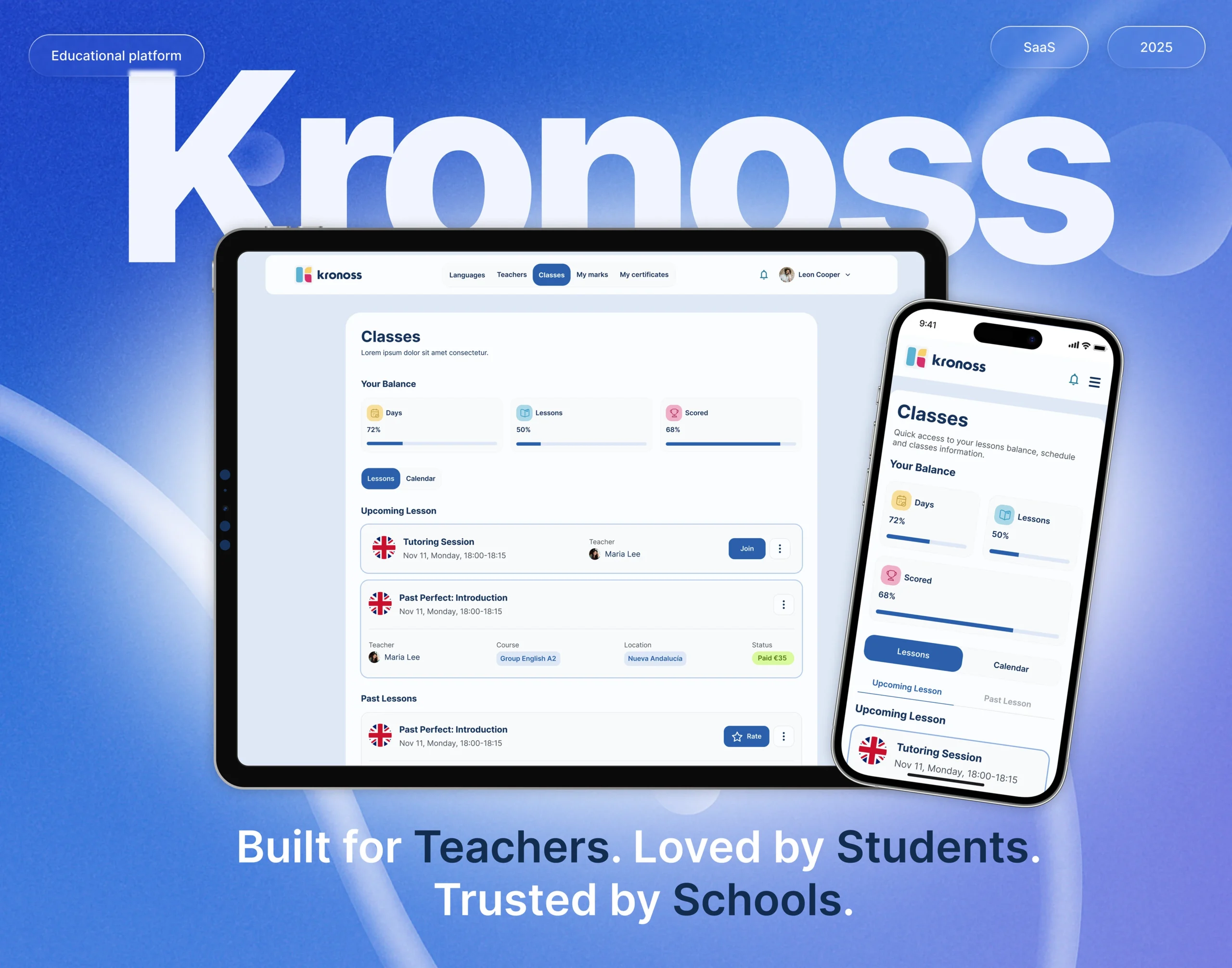
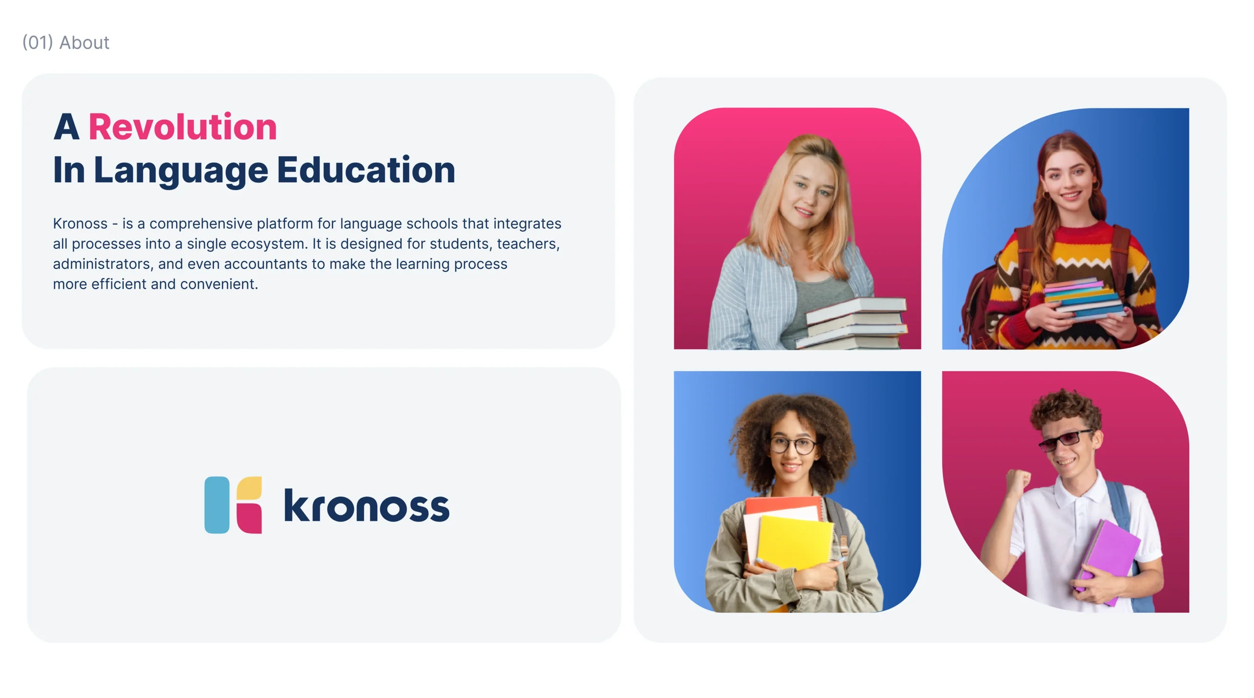
Kronoss is a modern educational platform created to serve the operational and instructional needs of language schools. It connects students, teachers, administrators, and parents within a centralized ecosystem, ensuring streamlined management, real-time learning updates, and role-specific functionality. Muse Creatives was brought on board to reimagine the entire user experience across desktop and mobile, aiming to elevate usability, scalability, and clarity while reducing administrative friction. Our design overhaul focused on integrating complex school operations into a cohesive and intuitive product experience tailored for real-world educational routines.
Problems
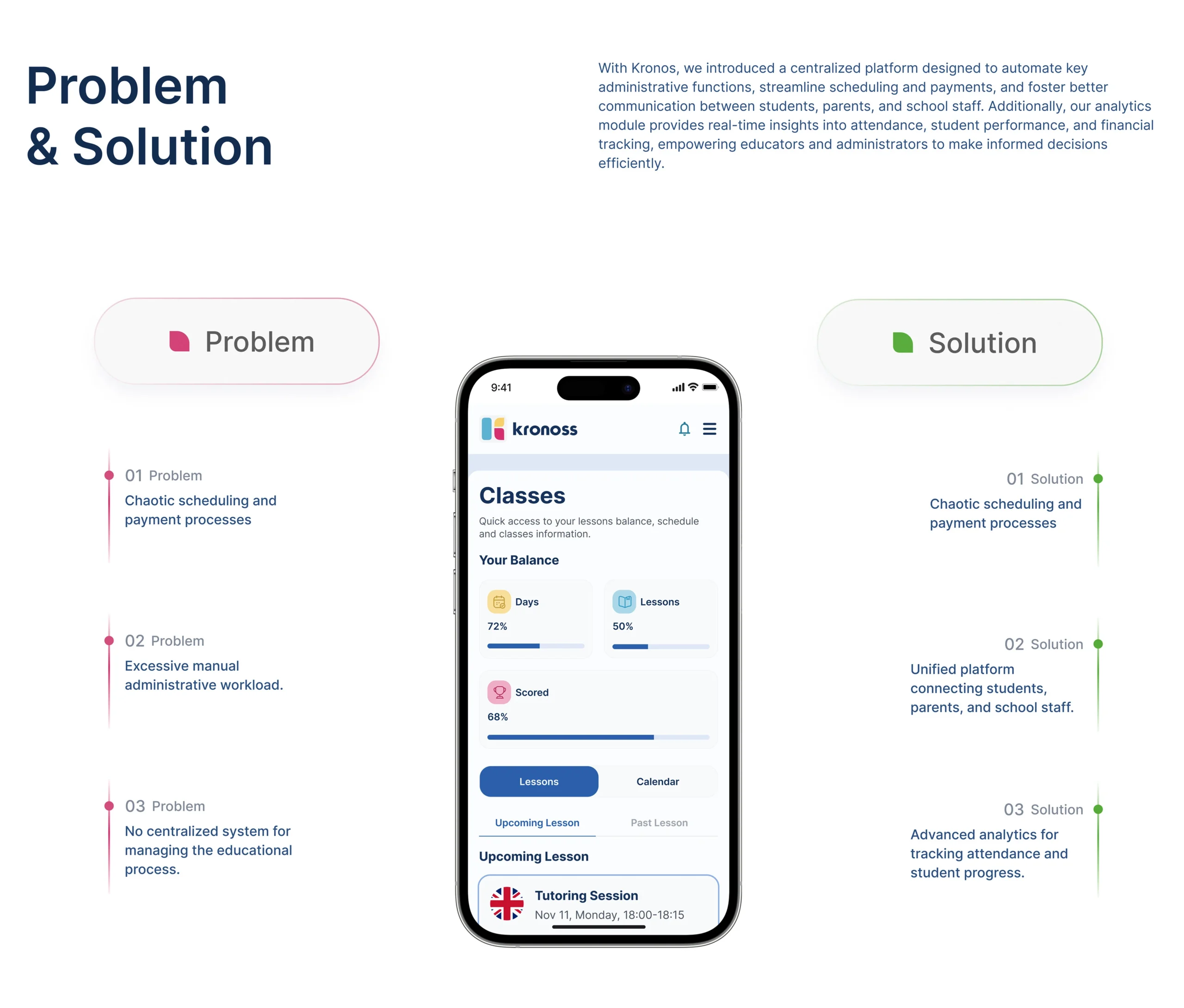
Despite its promising vision, the original Kronoss interface lacked role-based personalization and clarity across user journeys. Students found the experience rigid and hard to navigate, teachers struggled with cluttered lesson management, and administrators faced difficulties with class scheduling and real-time reporting. The lack of scalable UI and responsive behavior further limited the platform’s ability to grow. Fragmented workflows and inconsistent visual patterns created inefficiencies, making even basic tasks like performance tracking or payment updates feel cumbersome.
Challenges
The challenge was to redesign Kronoss into a scalable education tool without overwhelming its diverse user base. Each user group, student, parent, teacher, and administrator, needed its own dashboard with distinct goals, yet all users had to feel like they were inside a unified experience. We had to build an experience that catered to complex administrative tasks and educational tracking, all while keeping the interface minimal, accessible, and mobile-optimized. Ensuring seamless transitions across devices was another critical focus, especially given the remote and hybrid nature of modern learning environments.
Solutions
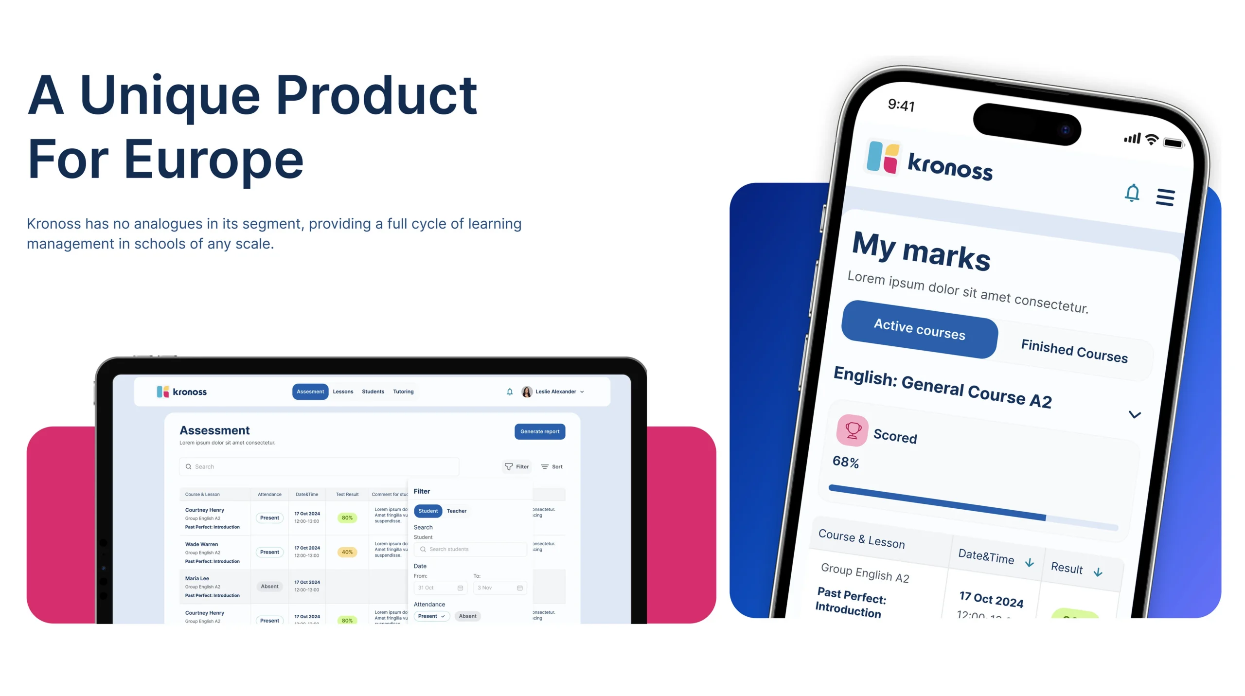
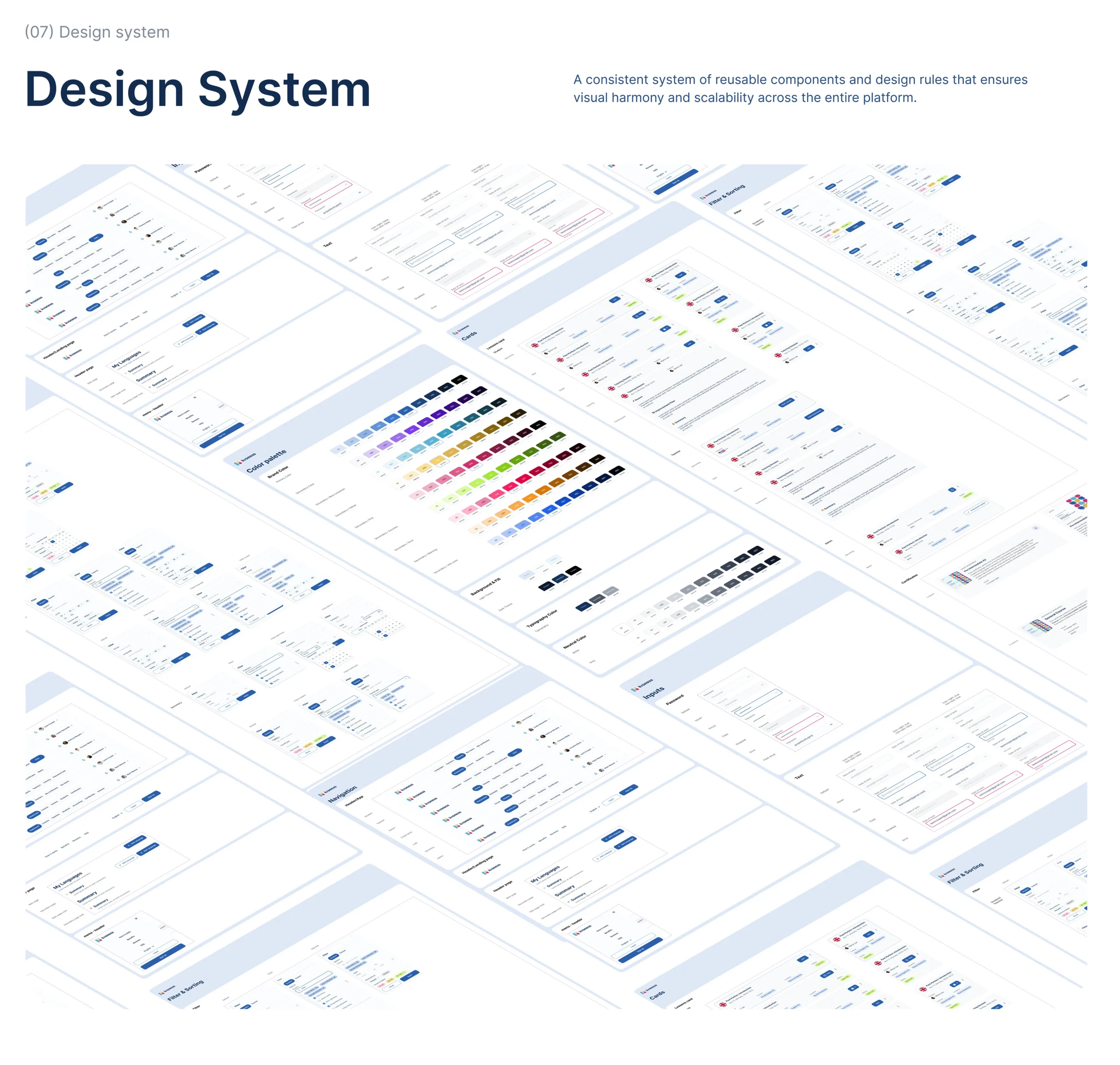
Our team developed clear flows and streamlined interfaces across all user roles, ensuring the design empowered users without introducing friction. Each user type was given tailored modules, students had access to lessons and grades, parents could track performance, teachers could manage classes, and admins could control the full system with analytics dashboards. The entire system was anchored on a reusable design framework, which guaranteed visual harmony and simplified future updates.
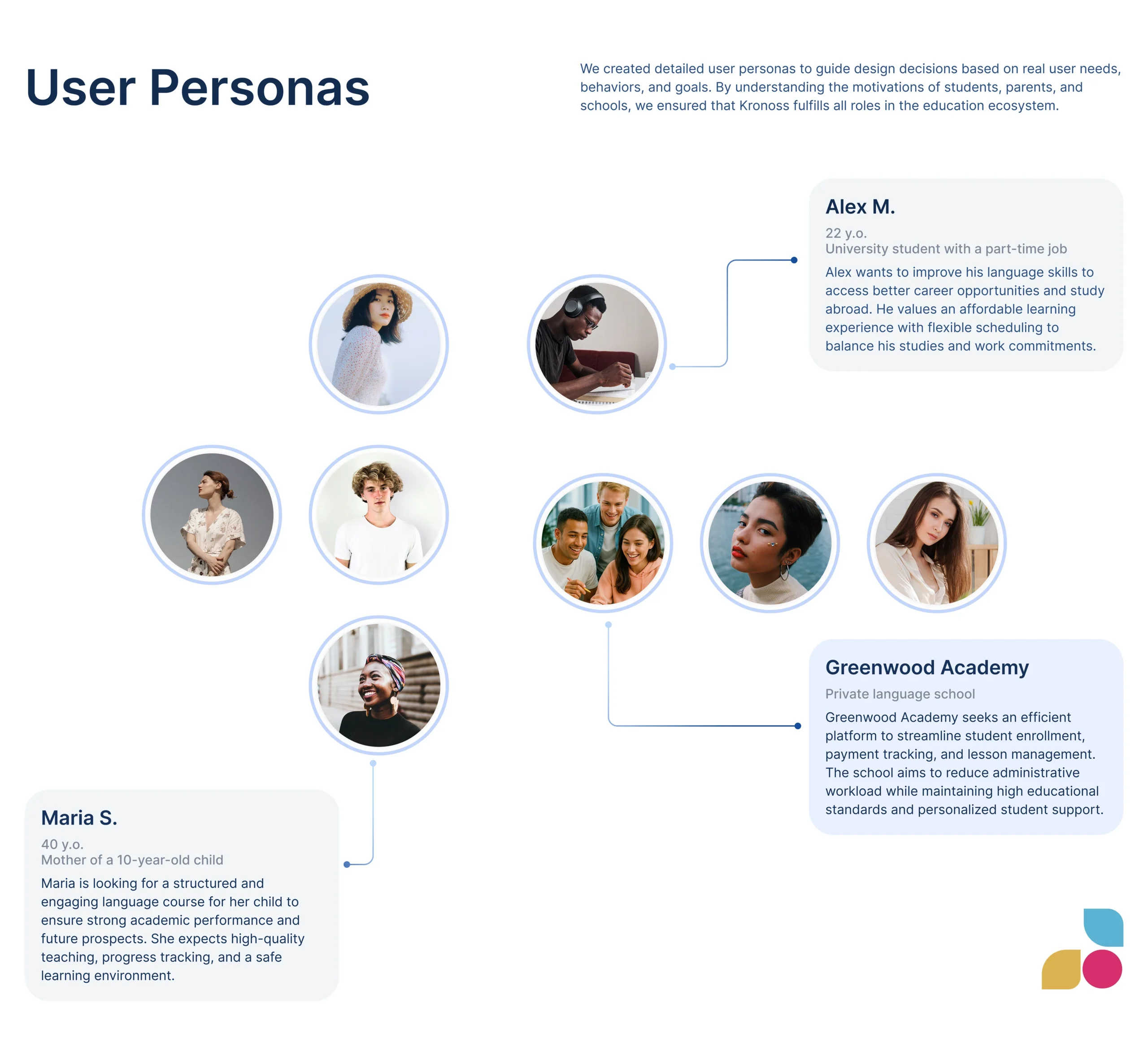
User Personas
To ensure Kronoss met the practical needs of its audience, we developed detailed user personas based on surveys and contextual interviews. One example was Alex M., a 22-year-old university student balancing part-time work and language classes. He needed flexibility, intuitive scheduling, and affordable learning tools. These personas helped shape our decision-making around dashboard layouts, alerts, and multi-device compatibility.We created user personas to represent the diverse target audience for the personal finance service. These personas were developed based on insights gathered from user interviews and research, capturing the unique characteristics, financial goals, and challenges faced by potential users. This approach allows for a tailored solution that effectively meets the needs of each user segment.
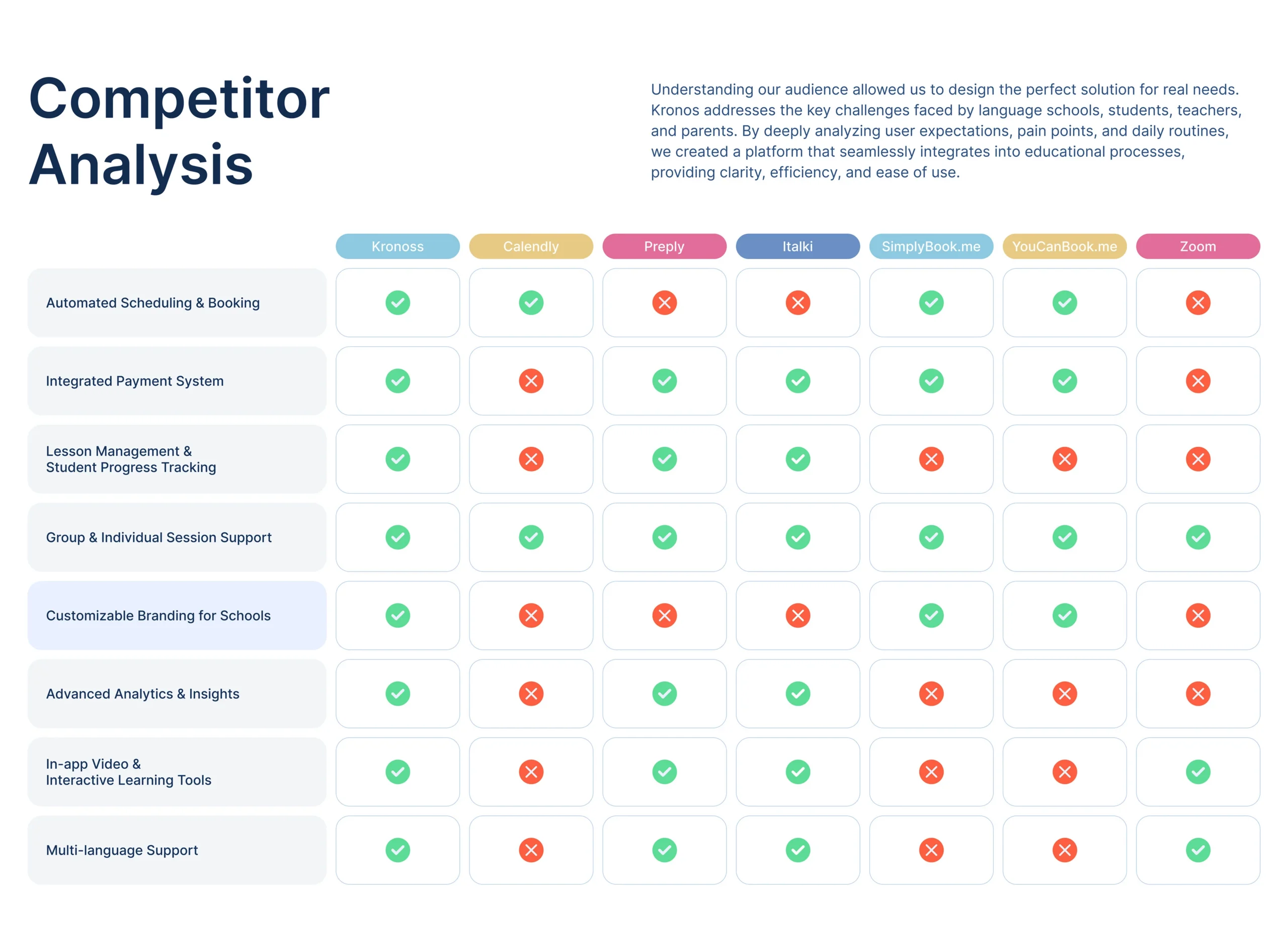
Competitor Analysis
We benchmarked Kronoss against top education and scheduling platforms like Calendly, Preply, and Zoom. While most competitors offered fragments of what Kronoss envisioned, none provided a unified solution. Our analysis revealed that Kronoss had a unique opportunity to lead with integrated booking, progress tracking, and branding flexibility, all of which we elevated through UX strategy and scalable UI components.
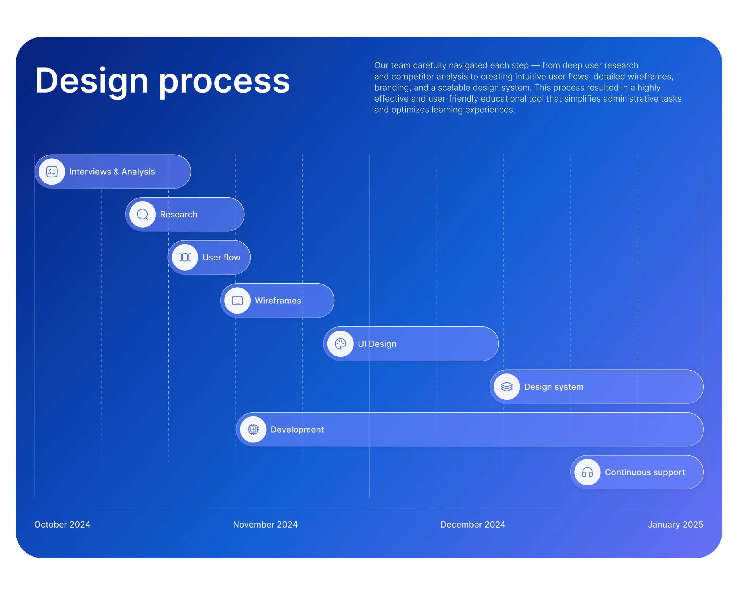
Design Process
The design process was anchored in methodical steps, from user research and journey mapping to wireframes, branding, and full-scale prototyping. We conducted competitor analysis to validate feature gaps and then built user flows around common challenges faced by language schools.
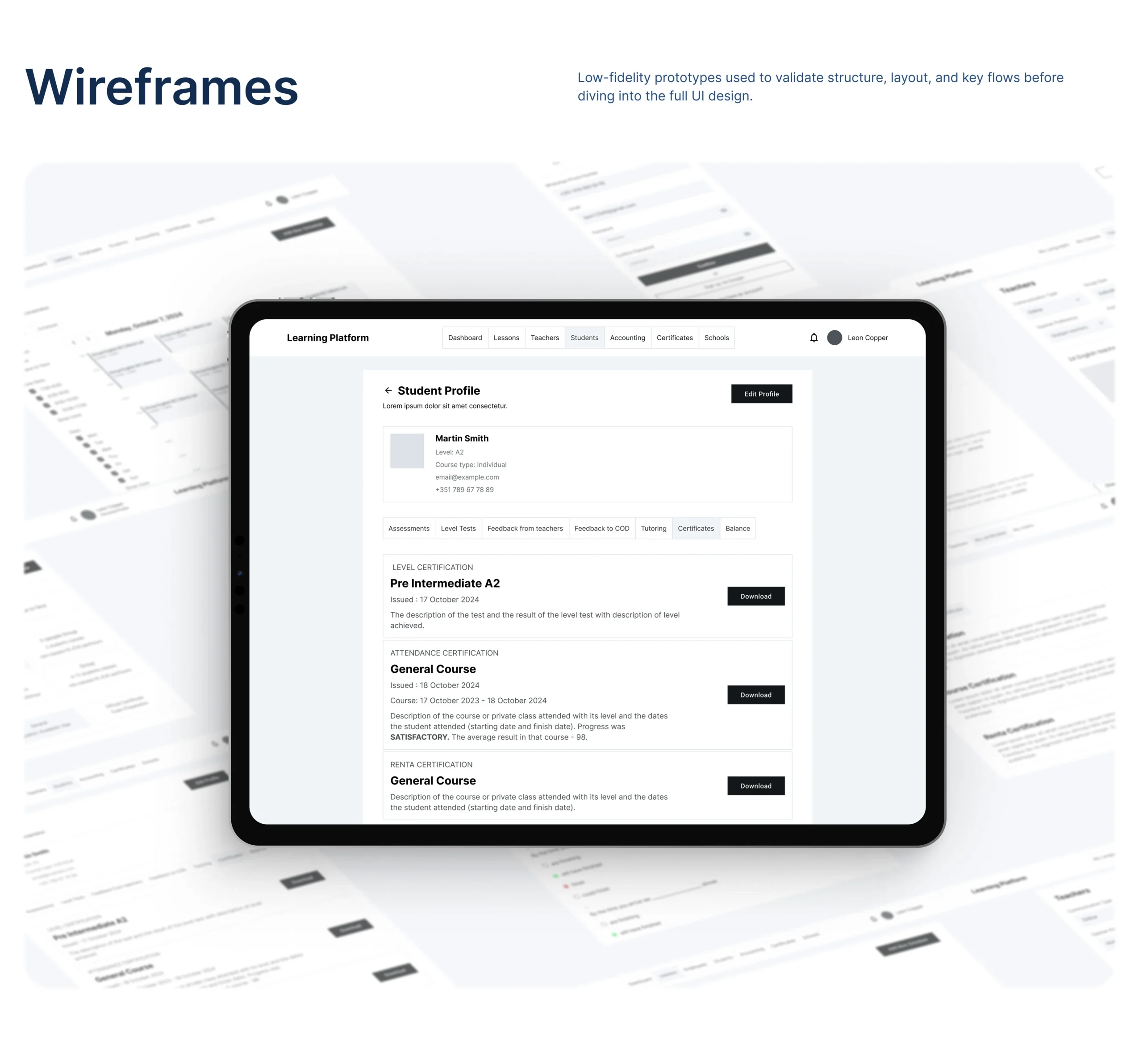
Wireframes
Low-fidelity wireframes were crafted to validate the structure of each role’s dashboard. We emphasized navigation clarity, prioritizing modular card layouts that could expand as new features were introduced. These early-stage screens helped align technical constraints with user flow priorities.
UI Design
The UI was designed to feel welcoming, functional, and adaptive. Our visual language used soft gradients and clean typography, creating a balance between youthful energy and professional tone. We ensured visual distinction between roles through iconography and subtle color shifts, maintaining consistency across desktop and mobile.
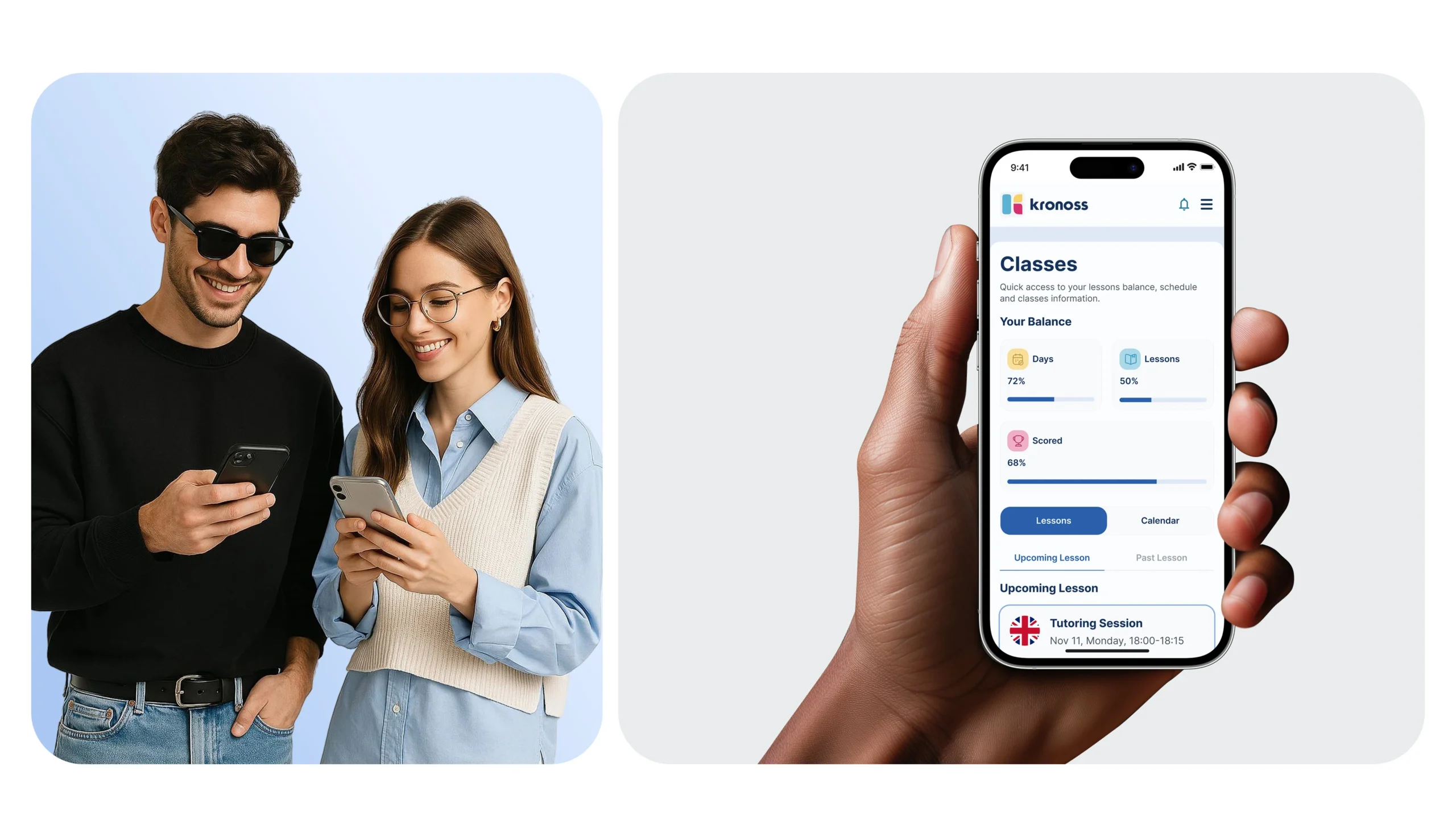
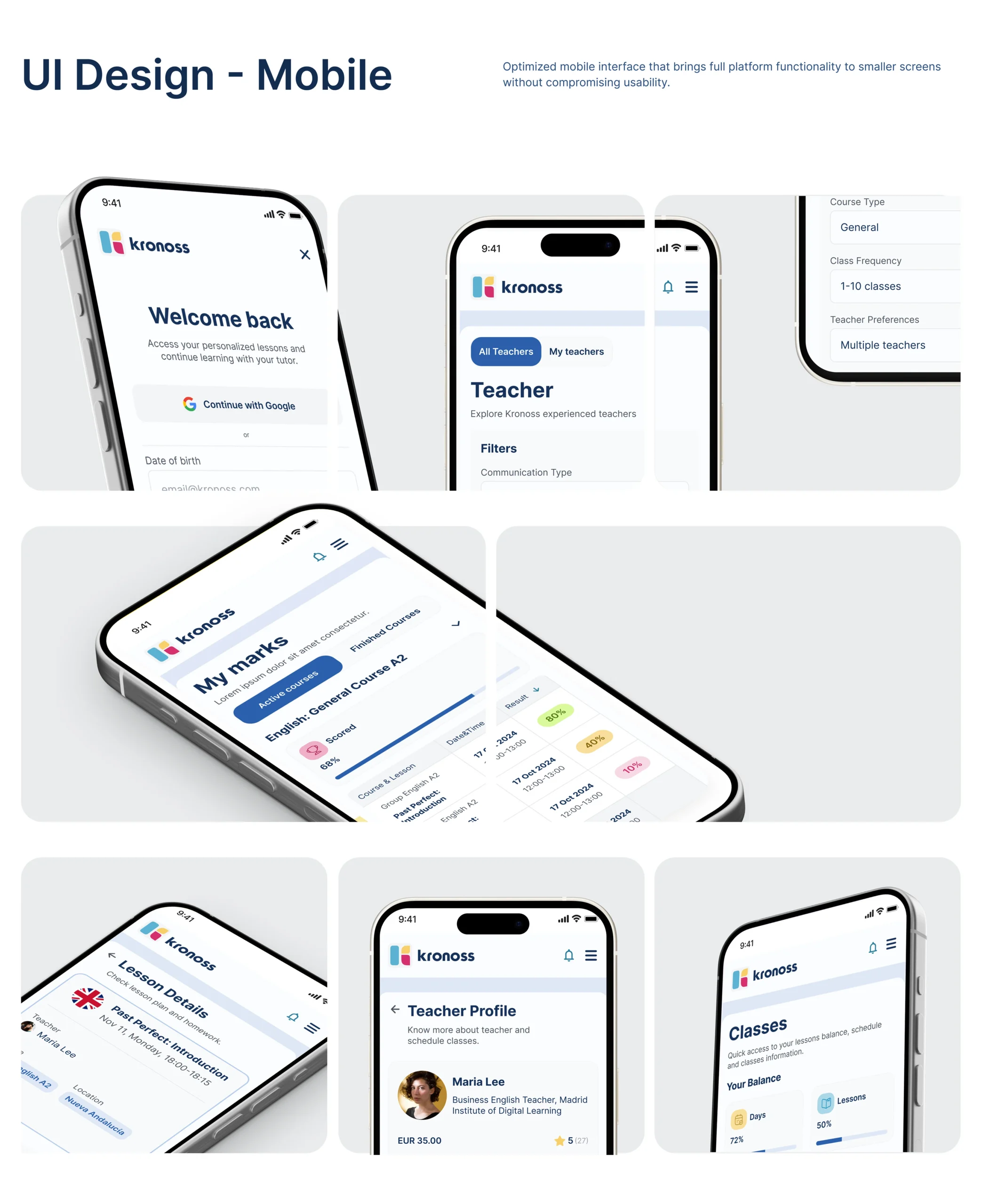
UI Design – Mobile
For the mobile version, we focused on adaptive layout patterns that preserved the full functionality of the desktop experience. The mobile interface allowed students and staff to manage lessons, track performance, and communicate, all without sacrificing usability. Every tap, swipe, and modal was optimized for ease of access on smaller screens.
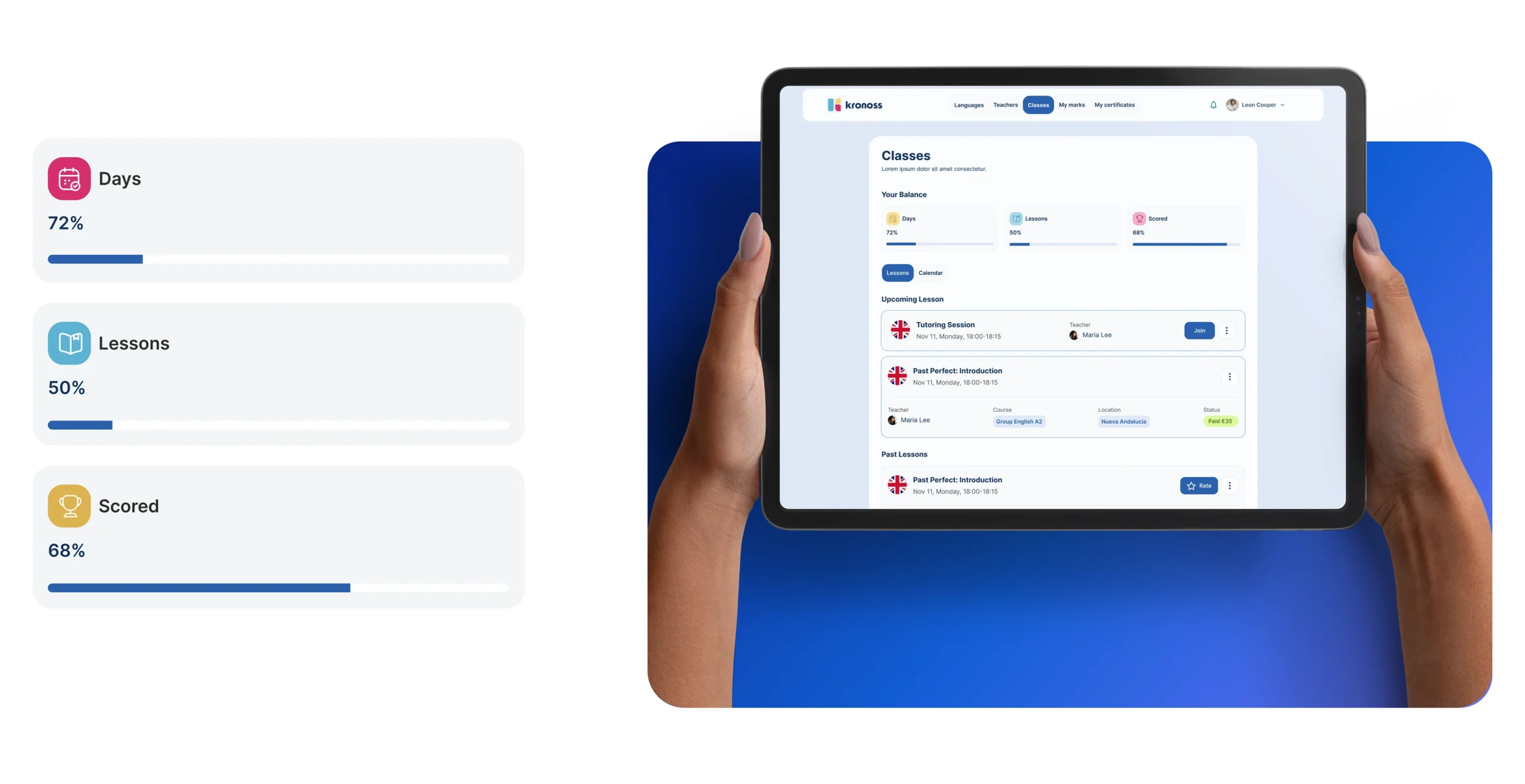
Desktop & Responsive
We built flexible grid systems that scaled perfectly across devices, from desktops used in offices to tablets and phones used by students and parents. The interface dynamically adapts to resolution changes without disrupting flow or hierarchy, creating a seamless experience across every device type.
Design System
Have a Design Vision in Mind? Let’s Shape It Together
We’ll kick things off with a quick discovery session to understand your needs. Once aligned, we’ll share a tailored proposal and get started upon approval.


