Logistics App Interface for Seamless Package Transfers
Company
Streamlined
Category
Logistics
Timelines
12 Months
SErvice we provided
About the Project
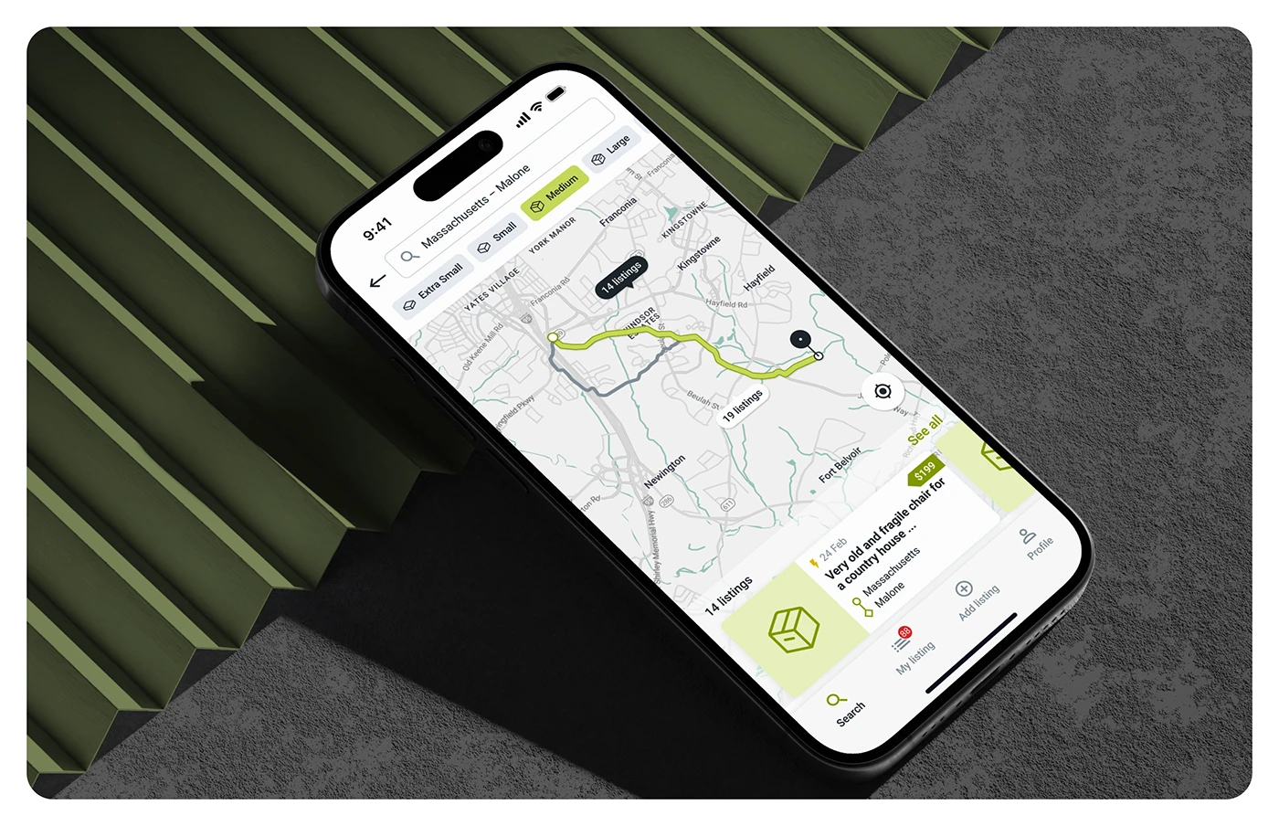
Streamlined is a logistics tech company focused on building a smart, user-friendly platform to connect senders and couriers. The goal was to simplify the full cycle of package exchanges, registration, real-time tracking, and delivery through a clean, efficient mobile experience. The app serves both individuals and businesses, offering automated trip creation, smart matching, and integrated Google Maps functionality.
Problems
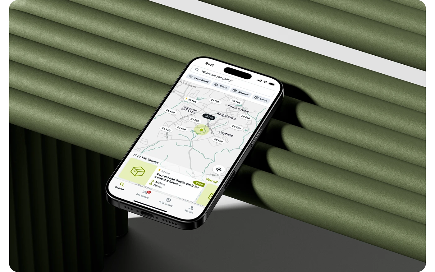
Existing courier apps were cluttered and lacked clarity in navigation. Users often struggled with creating shipment requests, tracking deliveries in real time, or managing payment confirmations. There was no cohesive experience between user roles (senders vs. drivers), and UI inconsistency caused friction during key actions like setting drop-off locations or matching packages.
Challenge
We needed to design a scalable solution that offered clarity and control to both parties, without overwhelming them with complexity. The logistics flow involved several touchpoints, such as package creation, booking, driver matching, and feedback collection. It was essential to maintain functional simplicity while offering robust backend support for continuous delivery cycles.
Our Solutions
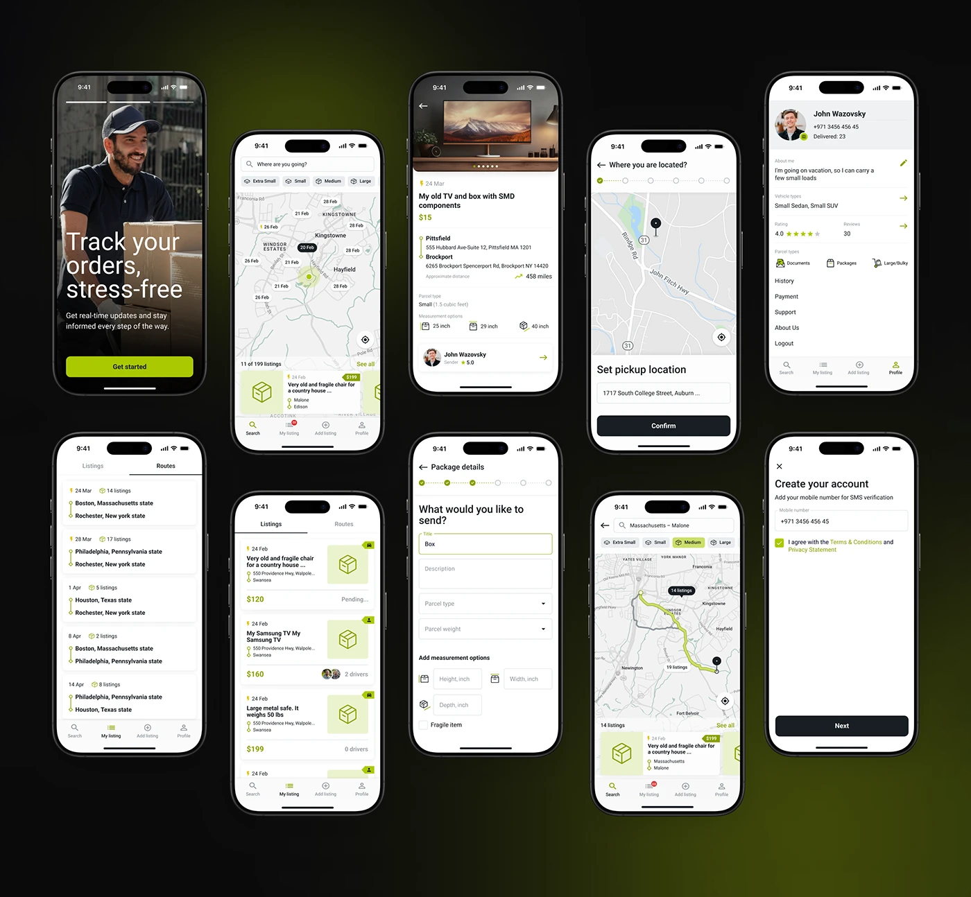
We focused on creating a seamless experience that connects couriers and users through intuitive flows and purposeful design. Our approach started with in-depth user research to understand pain points across package sending, tracking, and delivery. We streamlined the interface using a modular layout that adapts to user actions, from setting drop-off points to booking and payment. Interactive components were designed to minimize decision fatigue and ensure clarity at every step. With a consistent visual language, real-time tracking, and minimal friction across tasks, we delivered a design system that supports both functionality and trust.
UI Design
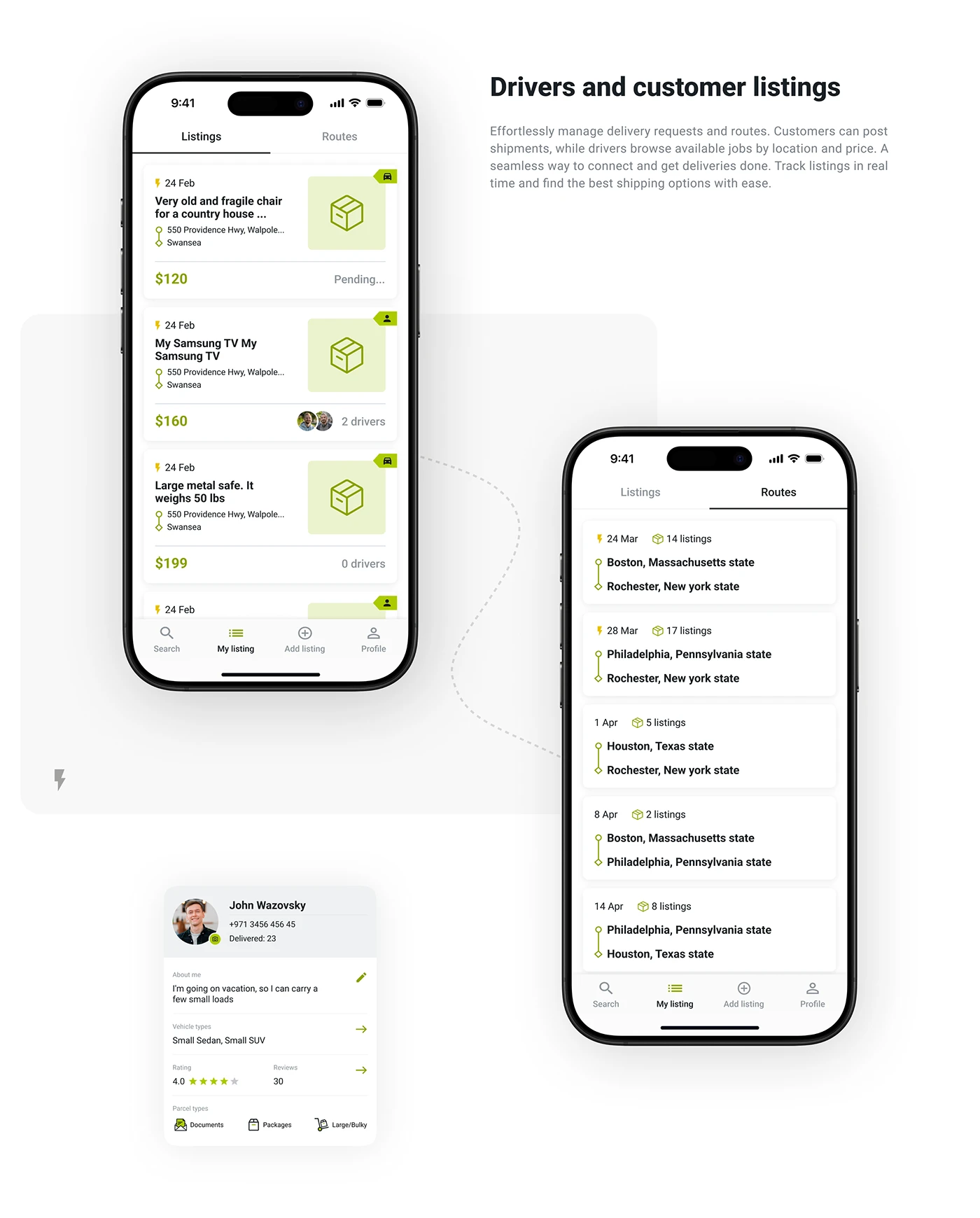
We focused on building clean, easy-to-navigate screens with clear CTAs. Green buttons guide users toward critical actions like placing an order, confirming pickup, and submitting feedback. Screens were designed for both sender and driver journeys, with frictionless transitions between each stage, from login and welcome to order status and delivery details.

User Flow
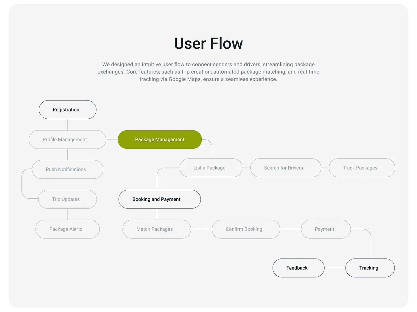
We designed an intuitive flow that guides users from registration to delivery completion. Core features like trip creation, smart package matching, and GPS-enabled real-time tracking were visually mapped to reduce user friction and improve task speed. Both new and returning users can quickly locate and act on their tasks with minimal confusion thanks to the flow.
Workflow Plan
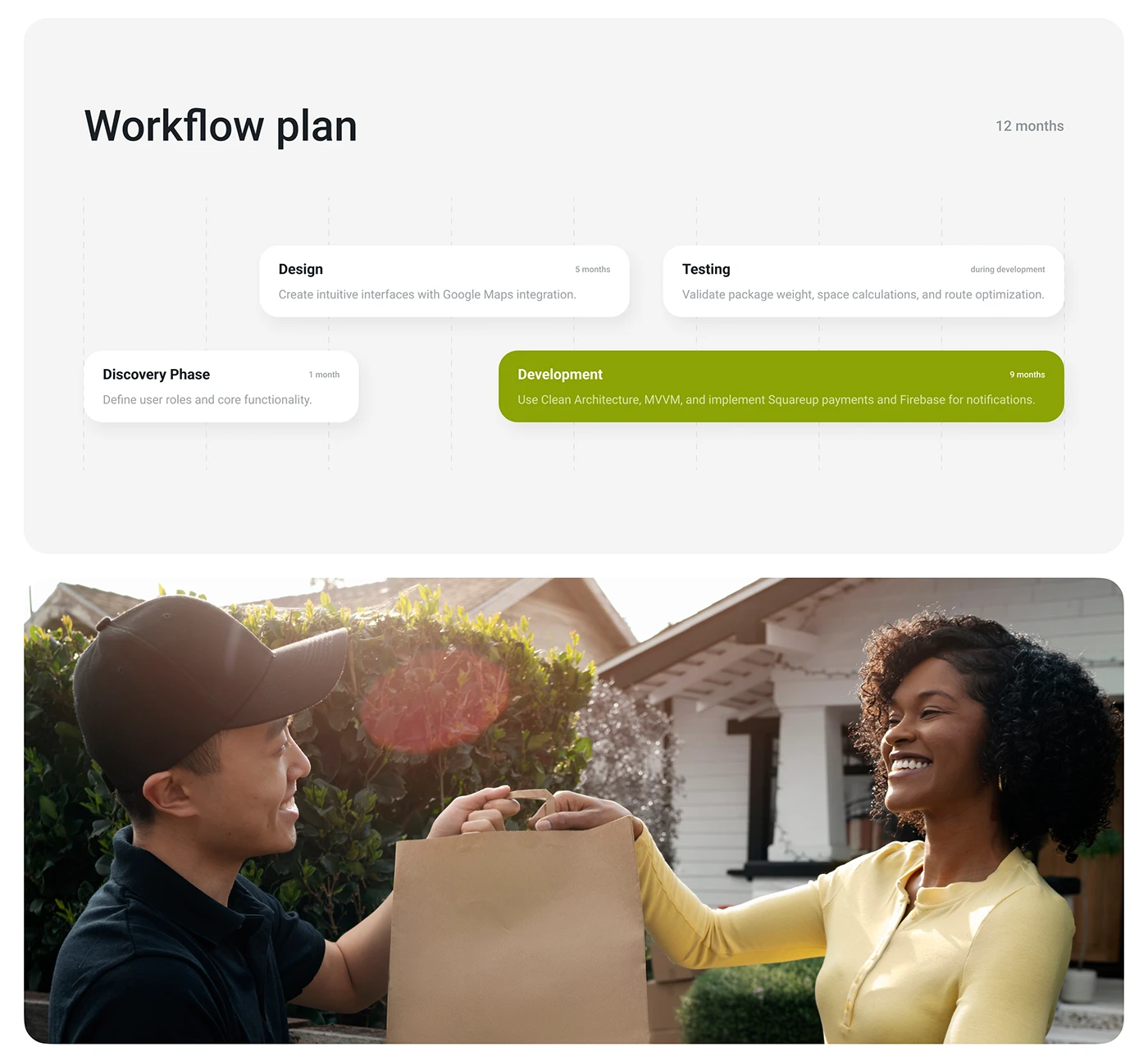
The project followed a four-phase timeline, beginning with the discovery phase, where we conducted user research, mapped key tasks, and defined feature priorities. During the design phase, we developed wireframes and high-fidelity UI mockups while integrating real-time features like Google Maps to enhance usability. The development phase supported the implementation of our design system, ensuring smooth frontend execution and API readiness. In the testing phase, we validated the interface through usability checks. Resolved visual and interaction issues, and prepared the product for its launch.
Visual Style
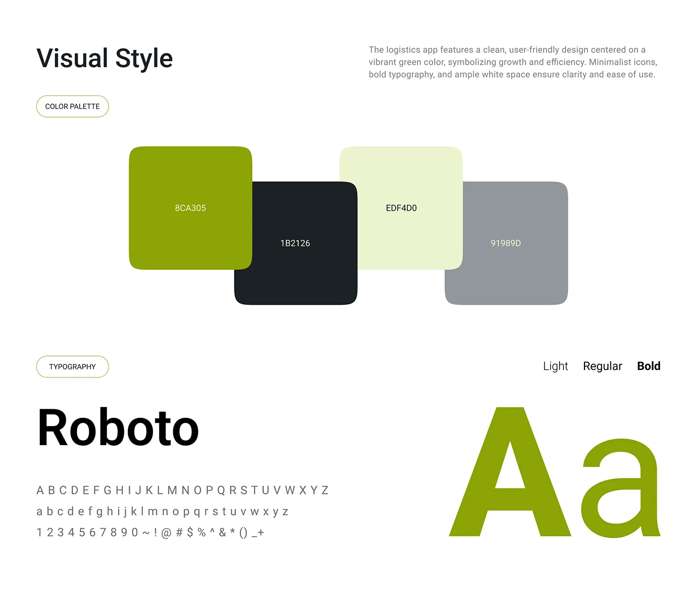
The app’s design centered around a vibrant green color palette, symbolizing efficiency, movement, and sustainability. Clean layouts, minimalist icons, and bold Roboto typography contributed to an interface that feels both modern and accessible. Ample white space was used to improve readability and maintain a frictionless flow.
Typography & Color System
The visual identity of the app was built using the Roboto typeface in Light, Regular, and Bold weights to maintain clarity and consistency across screens. The primary color palette included a vibrant green (#84A835) for key action buttons, deep black (#1B2116) for main text, soft light green (#E2F4AC) for highlights, and a neutral gray (#9B9B9B) for secondary elements and subtle UI components. This combination ensured visual hierarchy, accessibility, and a modern, approachable feel.
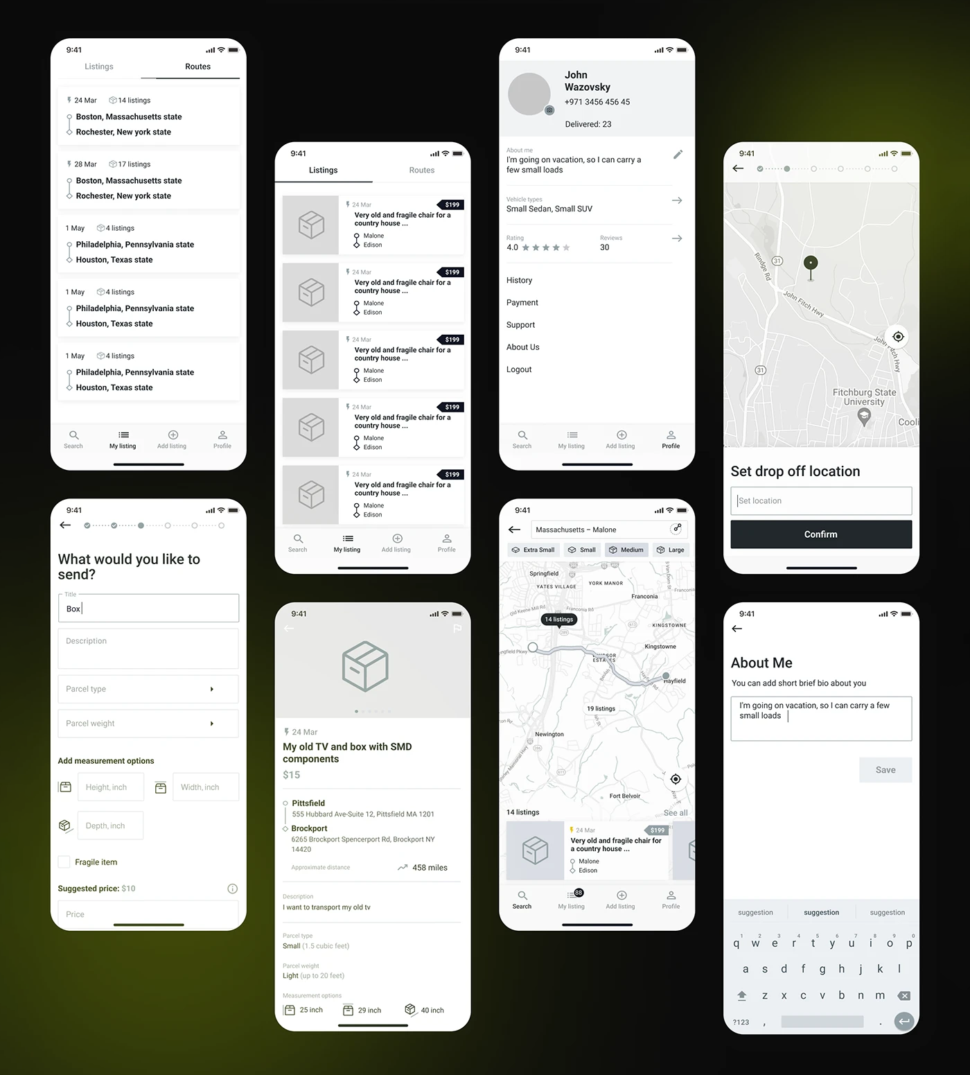
Low-Fidelity Prototypes
We built wireframes to visualize the full structure early in the process. These included key user tasks like order creation, setting drop-off locations, driver communication, and shipment tracking. Iterative usability testing helped validate layout choices and functional prioritization before moving to the final design.
Have a Design Vision in Mind? Let’s Shape It Together
We’ll kick things off with a quick discovery session to understand your needs. Once aligned, we’ll share a tailored proposal and get started upon approval.

Not Interested to submit the form? Book A Call Directly


