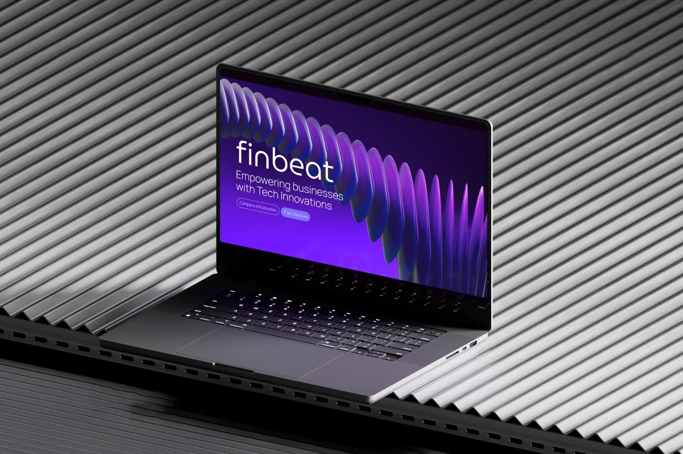
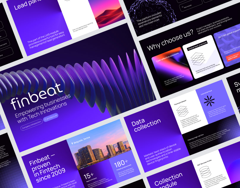
Finbeat, a global fintech powerhouse with operations across four continents, needed a presentation that would represent its evolution and innovation in the finance sector since 2009. With over 180 professionals and more than 15 years of fintech experience, the brand wanted to showcase both technical architecture and cultural ethos. Muse Creatives was brought in to reimagine their corporate presentation into a compelling, modern, and scalable design system, capturing the brand’s strength in digital finance while reflecting its forward-thinking values.
Problems
The existing presentation failed to reflect Finbeat’s dynamic ecosystem. Slide content felt disconnected, lacked visual hierarchy, and didn’t communicate technical value to a diverse audience. Text-heavy formats made it difficult to highlight data or product structure, while color usage and font styles appeared inconsistent and unrefined. Finbeat needed a narrative-driven format that could clarify architecture, humanize the brand, and remain flexible for evolving modules like LMS and lead management tools.
Challenges
We had to build a design that served two ends: one, to communicate deeply technical concepts like modular IT systems, and two, to highlight Finbeat’s brand legacy, values, and global team. The challenge lay in organizing abstract content, like platform modules and data pipelines, into a logical, digestible format for both technical and non-technical stakeholders. We also needed to deliver a distinct visual identity that could remain consistent across future internal and external decks.
Solutions
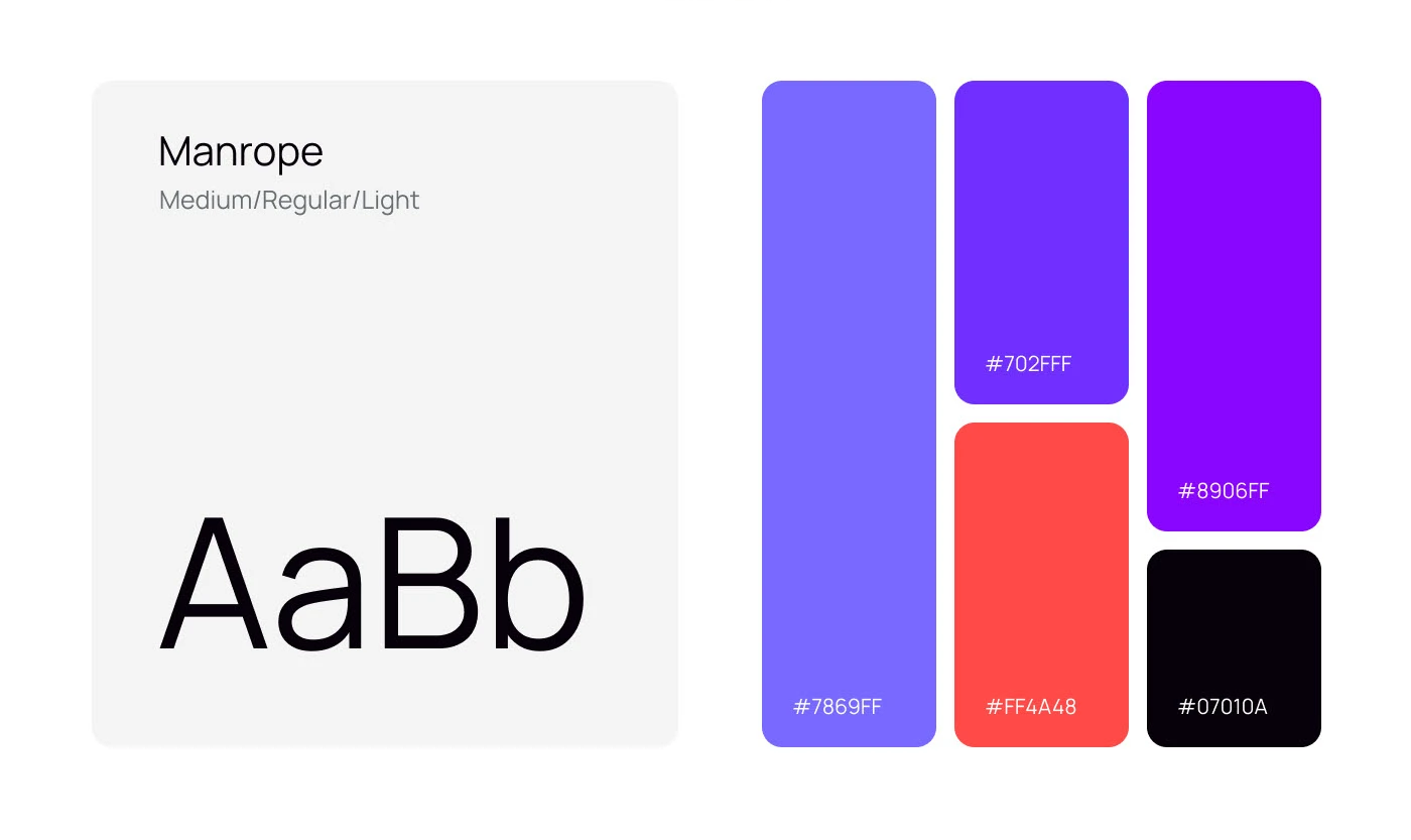
We started from the ground up, crafting a concept that used fluid visual metaphors and a modular layout system. Manrope was chosen for its modern clarity and scalability across media. We built a vibrant purple-based palette to balance Finbeat’s innovation-first identity with professionalism, using contrast zones to structure information and guide the eye.
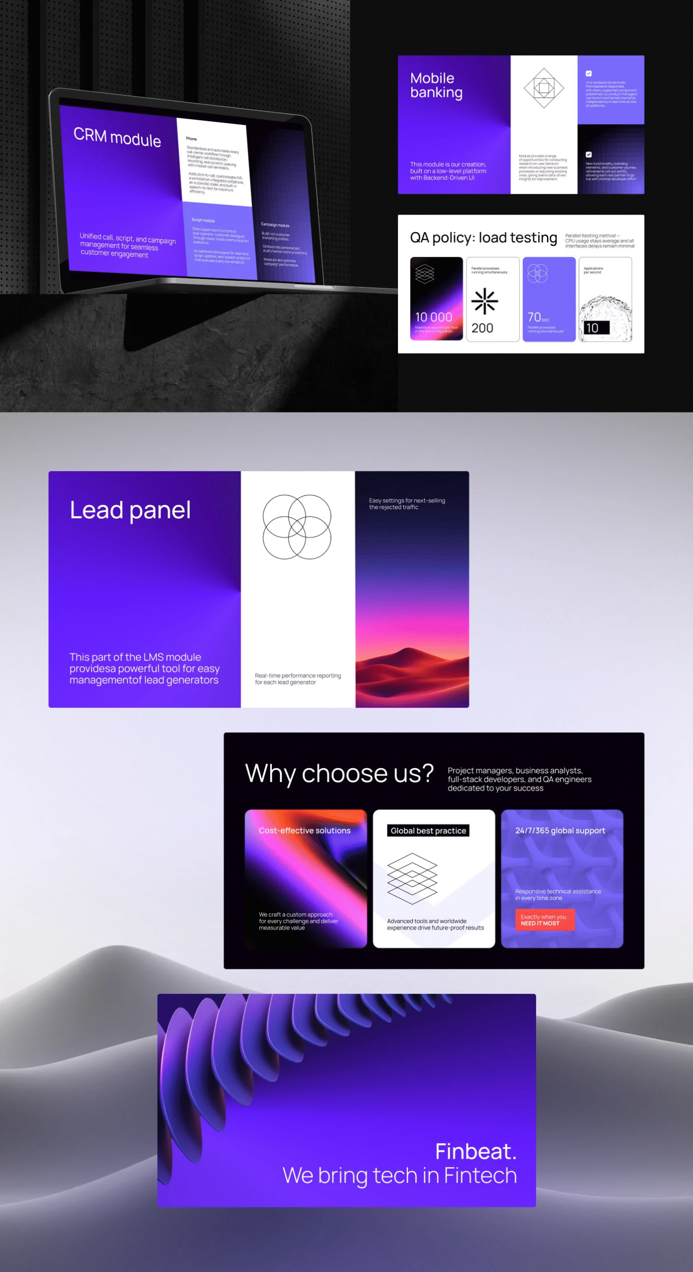
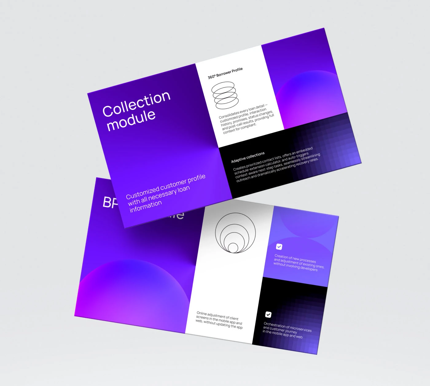
Each section of the presentation was treated as a self-contained story, from company profile to brokerage and LMS modules. We focused on:
Logical text hierarchy and white space for readability
Real-time data visuals and highlight blocks for performance insights
Custom iconography and overlays to represent abstract systems
Slide-to-slide flow that moved from macro to micro.
Typography & Color System
The final visual direction was grounded in the Manrope font family in Medium, Regular, and Light weights. This offered a clean, readable typographic voice across devices. The palette combined innovation-forward violets (#702FFF, #8906FF) with energetic contrast shades (#FF4A48) and neutral grounding (#07010A). This balance allowed us to support both dark and light UI scenarios, adaptable across all visual contexts.
Visual Output
The result was a presentation that could live beyond a single pitch.
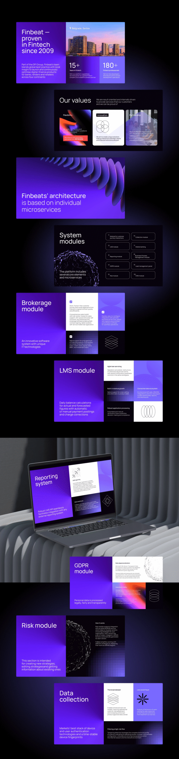
15+ Years of Fintech expertise communicated with visual trust
180+ Professionals worldwide introduced through modular team slides
LMS & Brokerage modules visualized with custom diagrams and icon layers
Lead Panel tools made accessible through clean charts and intuitive UI frames
Every slide now reflects Finbeat’s innovation DNA: bold, global, and future-proof.
Have a Design Vision in Mind? Let’s Shape It Together
We’ll kick things off with a quick discovery session to understand your needs. Once aligned, we’ll share a tailored proposal and get started upon approval.