MVP Fitness App Design for a Financial Wellness Brand
Company
FitFunds
Category
MVP Design
Timelines
6 Weeks
SErvice we provided
About the Project
FitFunds approached Muse Creatives to explore a concept at the intersection of wellness and financial health. They envisioned a fitness application that would motivate users to stay active through goal-based competitions and personalized routines. As an MVP, the app needed to demonstrate core value with a minimal feature set, yet feel engaging and scalable from the start. Our team was responsible for designing the entire user experience and visual direction, turning abstract wellness goals into an intuitive, elegant product ready for early-stage rollout and user validation.
Problems
Early ideation revealed gaps in clarity, hierarchy, and user flow. The original wireframe lacked a focused screen layout and did not accommodate the different types of content the platform required, from personal progress to community challenges. The interface was also missing a logical structure for presenting guided workouts, making it hard for users to interact with the app’s value in a meaningful way. For a financially backed wellness tool, this meant low retention risk right from the prototype stage.
Challenges
Our biggest challenge was balancing three user goals within one lightweight MVP: community interaction, self-tracking, and guided fitness experiences. Since this wasn’t a full-scale release, we had to strip the concept to its essentials while still preserving the emotional motivation of fitness and the aspirational quality of a premium financial wellness app. Ensuring that each screen was not only purposeful but also visually inviting was key to encouraging ongoing engagement from the very first session.
Solutions
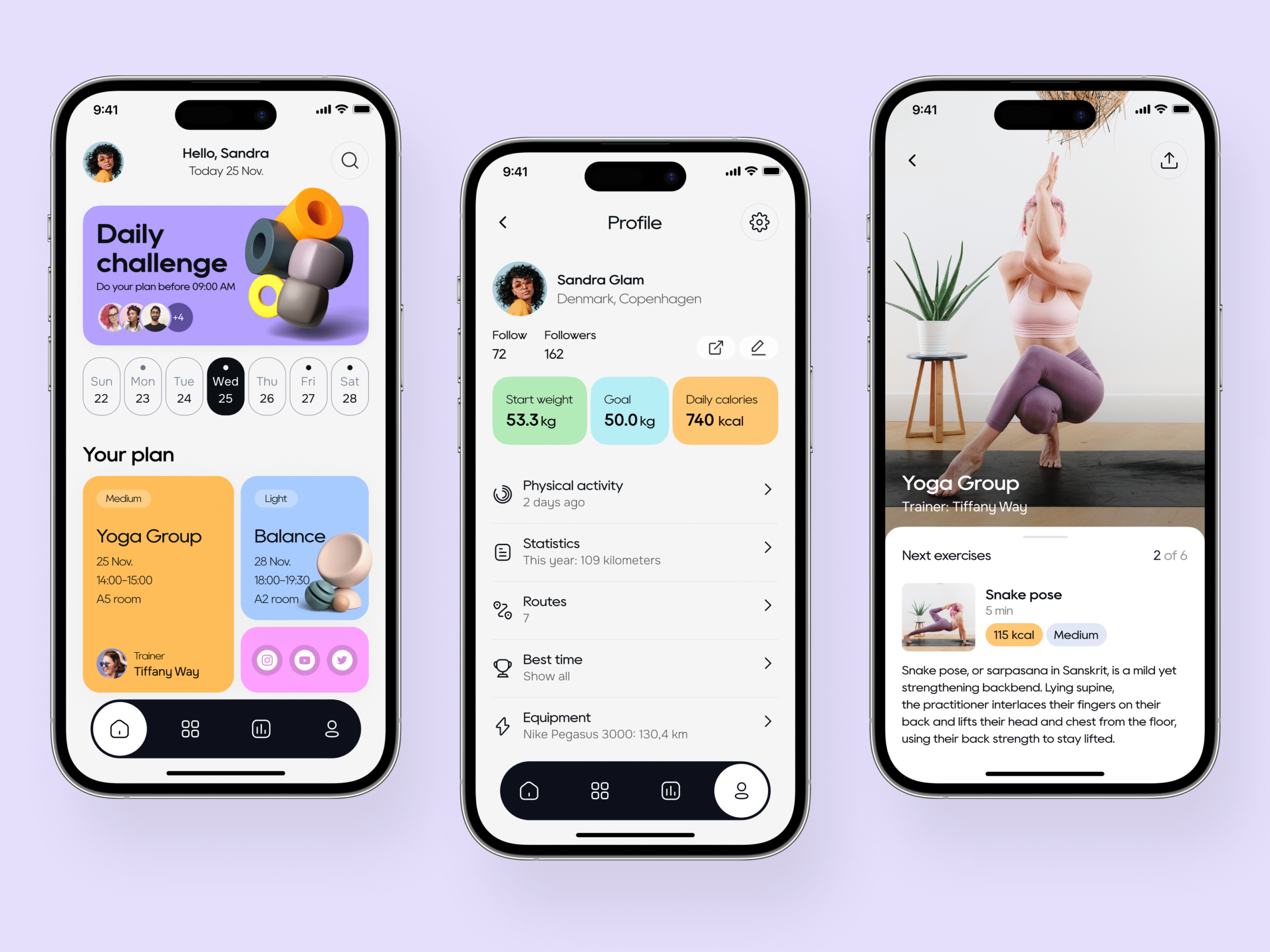
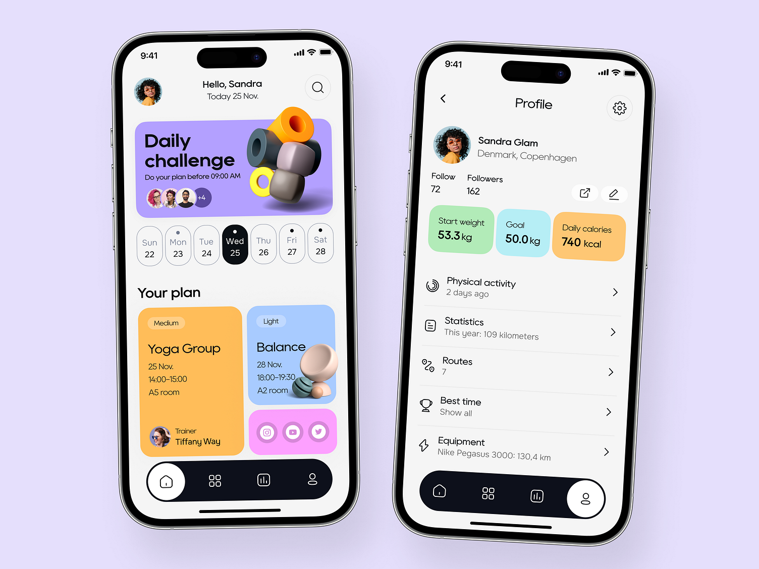
The MVP was structured around three core screens:
Community Hub: Showcased upcoming workouts and friend competitions to boost motivation.
Personal Dashboard: Displayed user achievements and profile information.
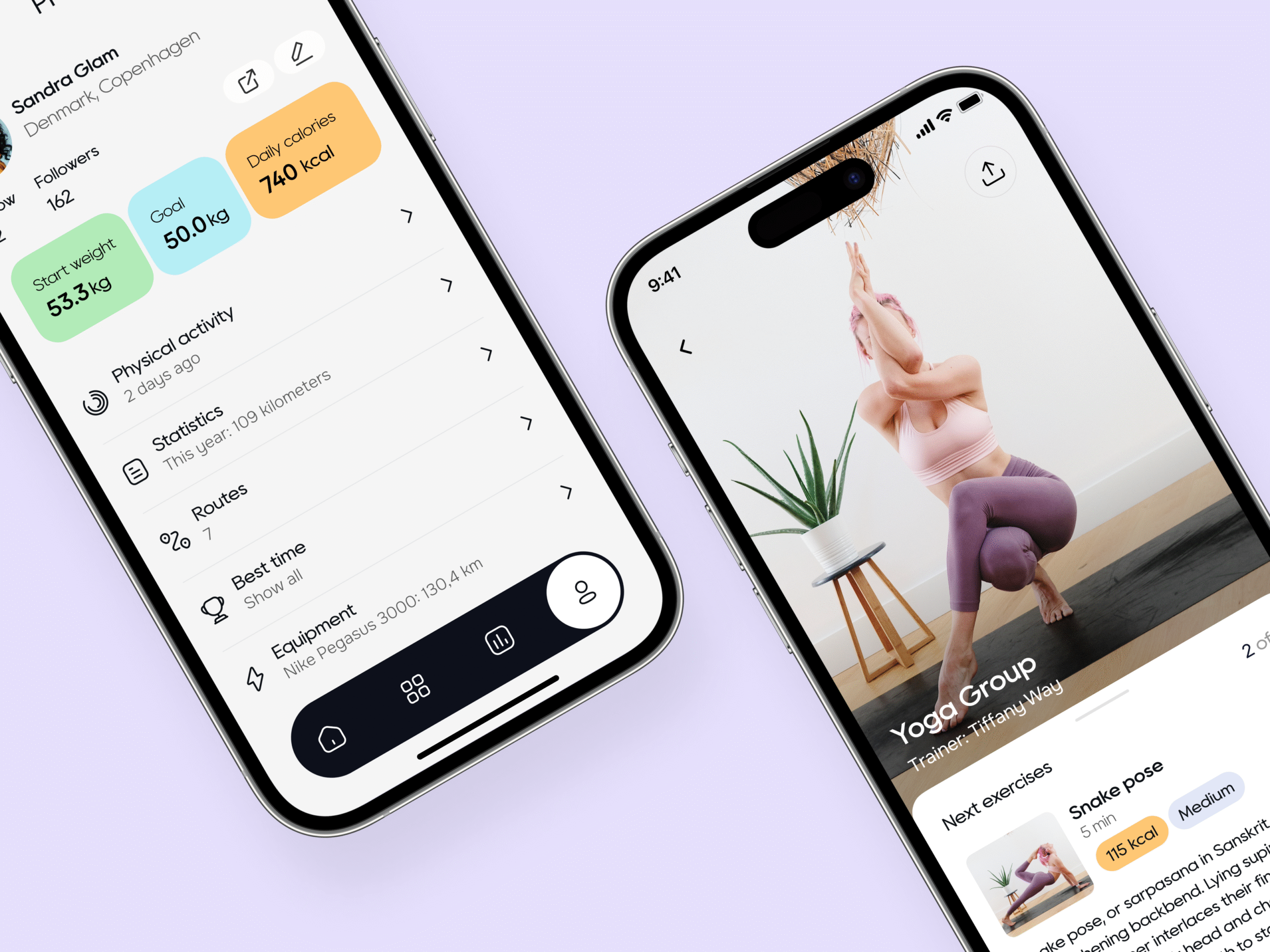
Guided Session: Featured a yoga workout with a detailed breakdown to demonstrate exercise flow.
The layout emphasized intuitive navigation and low-friction interactions.
Users could easily find key content like:
Exercise plans
Nutrition insights
Personal progress
The overall flow was designed to build user confidence from the first tap to the final interaction.
User Experience Strategy
The app’s user interface was designed to feel friendly and goal-driven. We created a consistent navigation pattern that gave users complete control while gently guiding them through features. Every interaction was stripped down to its essentials, yet layered with just enough motion and structure to deliver a premium feel. Navigation clarity was emphasized so that even first-time users could find what they needed without searching or guessing.
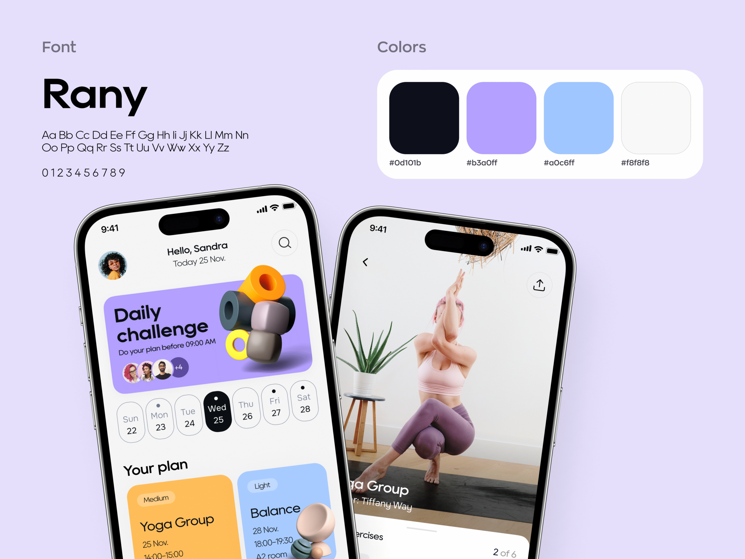
Visual Direction
The visual identity was crafted to strike a balance between energy and elegance. We opted for a dark purple-blue base with violet accents, layered with white space to maintain breathing room across screens. This palette evoked depth and calm, aligning with the app’s promise of focused progress. It also reinforced the brand’s connection to health and clarity, both physically and financially.
Outcome
With just three key screens, FitFunds now had a clear MVP to validate its core concept. The streamlined structure, intuitive interactions, and vibrant yet composed interface gave the product its unique voice in the crowded fitness space. More importantly, it created a seamless user journey that supported fast iterations, investor conversations, and real-world testing from day one.
Have a Design Vision in Mind? Let’s Shape It Together
We’ll kick things off with a quick discovery session to understand your needs. Once aligned, we’ll share a tailored proposal and get started upon approval.

Not Interested to submit the form? Book A Call Directly


